

More info about it here: https://www.ghacks.net/2024/08/13/windows-11-start-menu-is-getting-a-new-layout-to-organize-your-apps/
I love how microsoft never learns their lessons.
Ugh, fine Microsoft. I’ll finish my migration to Linux this weekend.

I tried it but stopped once I realised there was no hdr support :(
There is HDR support. At least Plasma 6 supports it.
Was this a call for help or…?
Someone made a post about enabling HDR support on Linux a day or two ago. Times have changed, and you might want to look into it again.
(I don’t have HDR monitors, but it works on my OLED Steam Deck.)
The Steam Deck is an exception to the rule, unfortunately. Game mode runs using Gamescope as the compositor, which allows it to directly manage rendering surfaces and support HDR output.
Support for HDR under a regular DE is still either nonexistent or a work-in-progress last I checked.
It’s been a hot minute, but they might have gotten HDR through some gamescope trickery. Sounds vaguely familiar…
Not sure why you’re getting downvoted. It literally only exists on a single desktop environment and even then it’s practically beta. On my TV it just shows everyhing as green and purple when I enable HDR.
I love linux and want it to keep improving but man people need to stop circlejerking linux so much when it comes to people using windows when it suits their needs
With more room for ads, I hope?!
i assume that’s what the sidebar is for
The sidebar looks like it’s dedicated to phone access?
it is, that was just me trying to be funny
My bad, I got whooshed
ha, oh look another revision no one asked for.
i had to use this recently, and its all kinds of useless now. the ‘search’ didnt find my installed app, the ‘all apps’ list is a click or two in, and then absurdly inefficiently styled… the win98 start menu was easier for me to navigate.
Oh for fucks sake, auto categorization is one of the thing I dreaded the most on iOS because it’s almost always incorrect and it doesn’t fit my usage at all. Hopefully it will be possible to disable this crap.
I love how modern UI = eating up as much space as possible, while displaying as little information as possible. Glad I can watch this shitshow from afar.
It’s hard to even take Windows seriously as a business OS when they’re shoving this overly padded UI down everyone’s throats. Windows 10 supported small task bars, among many other things that Windows 11 doesn’t. There seems to be a lot of really tone deaf people at Microsoft working in silos, not really aware of the features people care about in their own product.
Looks like someone at Microsoft saw someone’s iPad and went “That’s what we need! Icons in boxes that need an extra click to be used!” and their MBA boss figures they’ll get a bonus for “increasing user engagement” by making everything take two actions instead of one now.
Sigh.
From the linked article:
One interesting thing about it is that clicking on an icon instantly launches the app, without opening the folder.
200%+ engagement ratio
Llol, it’s funny but also probably true. God I hate statistics.
They want to be as sleek as apple but it comes off as an old man trying to be hip
And maybe I’m using it wrong, but it just…doesn’t work. I use spotlight search on my MacBook to find programs and things and it just finds them. It’s fast enough to be faster than me opening things off the dock.
I try to use the search on my wife’s Win11 computer and half the time it sends me to a website for a program she already has installed.
Like if you want to imitate, even badly, the imitation should at least be functional.
Every update with these new UI changes seems to increase empty wasted space each time
Another 500k lines of new code? Yay more bloat!
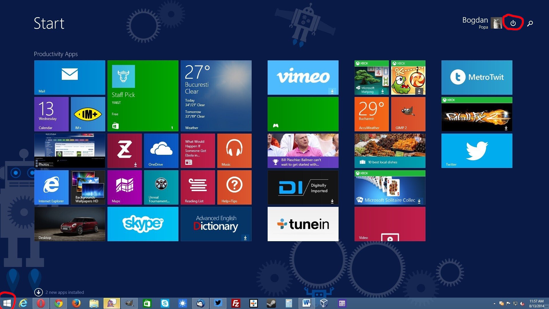
Oh cool, good to see the power button is still on the other side of the fucking menu. You know, the thing that I’m clicking on 90% of the time I’m opening the Start Menu? Why have that easily reachable like in past versions of Windows? Silly me I guess.
This isn’t the first time Microsoft has done this, I remember this being a huge gripe for me with Windows 8/8.1
Hey that was when they thought it was also a smart idea to force that shit tablet view on users…
And they did it on Windows Server too, which made even less sense.
Don’t your servers run on phones?
I didn’t mind it actually. Like I don’t mind the GNOME overview or whatever the thing that comes up when you press Meta is called
i love the workflow of gnome, it takes time to get used to but its really nice
Strangly this UI always reminds me of the hospital scene from Idiocracy… Click the icon for where it hurts
Uh THIS one goes in your mouth
Then you wouldn’t notice all the fun and exciting recommendations they have for you! /s
Power options: sleep after 5 minutes
Power button action: shutdown
You’re welcome
Right click the start button instead
If they didn’t take that away.
Just wait. At the rate they’re going it won’t be long before you’re forced to sit through a 30 second full screen ad in order to even open the start menu.
genuine question, why do you click that button? Why not use the physical button on the device?
I’m sitting at my desk and my computer tower is out of reach unless I get up and reach over. Gotta showcase that RGB
Software shutdown button presser chiming in.
There’s two reasons I tend to use the software button. I know for a fact that clicking “Shut Down” will actually shut down the computer. If I press the hardware button, the computer usually is configured by default to sleep. Yes, I could change this default behaviour on all the devices I use, but then there’s the second reason:
From a psychological perspective, I tend to associate the hardware button as a “only use if system is locked up” button.
Yep, if you’re in charge of managing hundreds of computers, you don’t want to guess at what it’ll do. We have our defaults but also have people who make exceptions depending on their own work needs. Tbh, I rarely use that button anyhow though, I right click on the start menu to get that menu instead and use shutdown, restart, or log out.
Further reason, the physical button isn’t always in a location that’s convenient to push. Sure it’s usually accessible, but sometimes it’s under a desk or behind a monitor or some other awkward location. Mouse and keyboard by their nature are always located in a conveniently accessible location.
So is Nadella redesigning all this stuff? Because it certainly doesn’t look like someone who is familiar with UI is doing it. Reminds me of when the CEO of Yahoo decided she could create a new logo in Corel Draw one night.
tvf this is still in canary, the final implementation will be more polished
Linux and gnome pretty much gtfo of the way for me - as an OS should. I used to care a lot about what Microsoft did, now I couldn’t care less - F em
KDE is the best and much easier and polished to ex windows users
Windows 11 gets a new all apps screen in the start menu*
Not my home screem!
I disagree. Microsoft is learning its lesson. It’s just that the vast majority of people are teaching Microsoft that its actions are perfectly acceptable, or, at the very least, not totally unacceptable… so it continues.


