

Questionable if this is only about movies, and not about any Bittorrent traffic.
What VPN nodes are used the most*
Exactly what I was thinking. A pirate in the west doesn’t stay a pirate for long without one.
Don’t need a VPN in my country.
While absence of China in Top 10 may be somehow explained by The Great Firewall, the absence of India, Turkey and Russia is totally implausible. Or they might be scanning only torrents of movies with English audio.
Most of the Indians use telegram these days.
Most Indians don’t know about Torrent and Piracy. hell if you tell an Indian they are pirating they would say “what is pirating? we are just downloading movies from Google!”
very inaccurate measure for piracy. for countries with average low uplink speeds most of them use hosting sites rather than torrent. this is basically a map of how good your internet quality of service is times your population.
A per capita map would also be nice.
Haha could have called it “where do people live?”
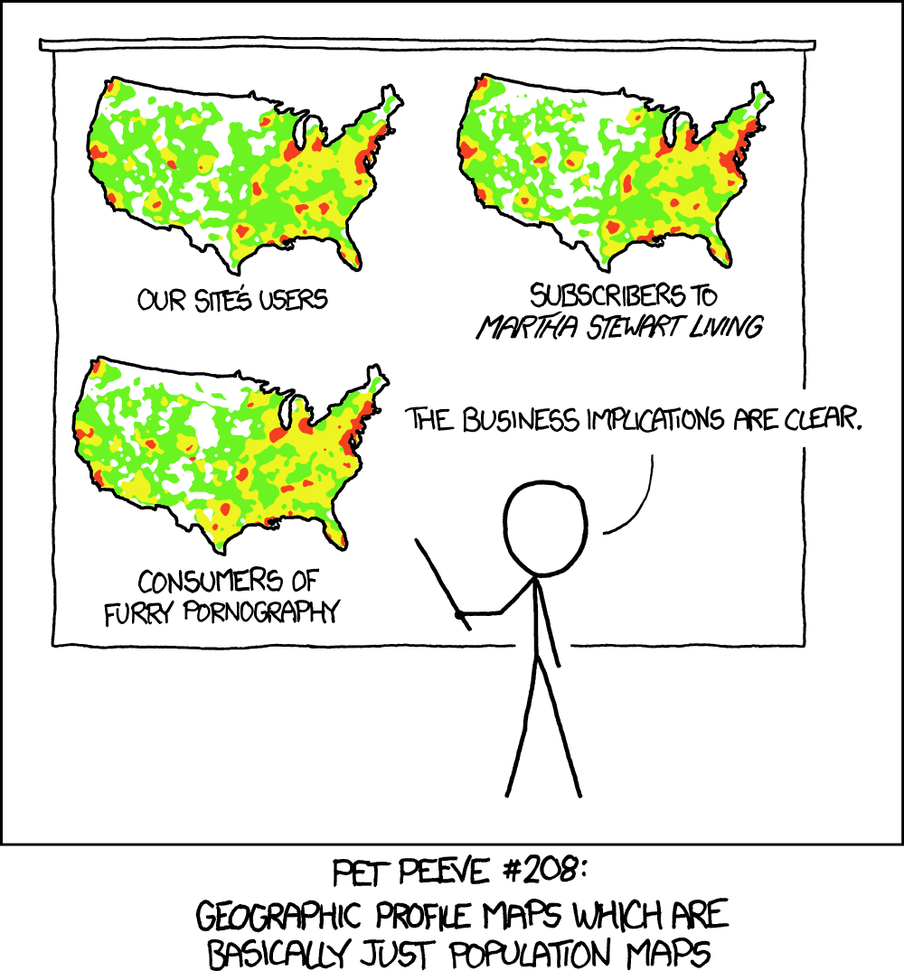
Reminds me of this xkcd (the US map even looks the same as the OP)
Ot is relevant so often 😂
Absolutely. Make one?
No u
It’s probably a map of where VPN servers are located mixed with countries that don’t persue copyright violations. And not necessarily where the users are located.
Are VPNs seriously that prevalent? In Australia, most internet providers aren’t also owned by media companies. So many have clearly stated policies that they will not pass your information on. Mine does, so I don’t bother with a VPN, there’s no reason too.
I know this is very much a tangent but honestly VPNs feel like a massive scam that everyone in the piracy community at large keeps perpetuating. Like, I’m pirating more content than I ever have because of subscription services, so I’m not gonna sign up for the extra special piracy subscription just because? And if I actually want privacy and anonymity while browsing I would, and do, just use tor.
Inaccurate because vpns
Cool, completely useless map that only shows population distribution 👌
Looks very inaccurate with russia being so under represented
I think Russians use DC++ or something else.
Why is Russia black here?
I would guess the map of IMBD voters would look similar.
And the map if beer drinkers, of smokers, of males, of people with pets etc. All would look like this. This is just a map, which shows where most people live.
Here’s the context on how the data was gathered https://www.ubaada.com/post/9be82972
Whichever in my vpn is connected?


