

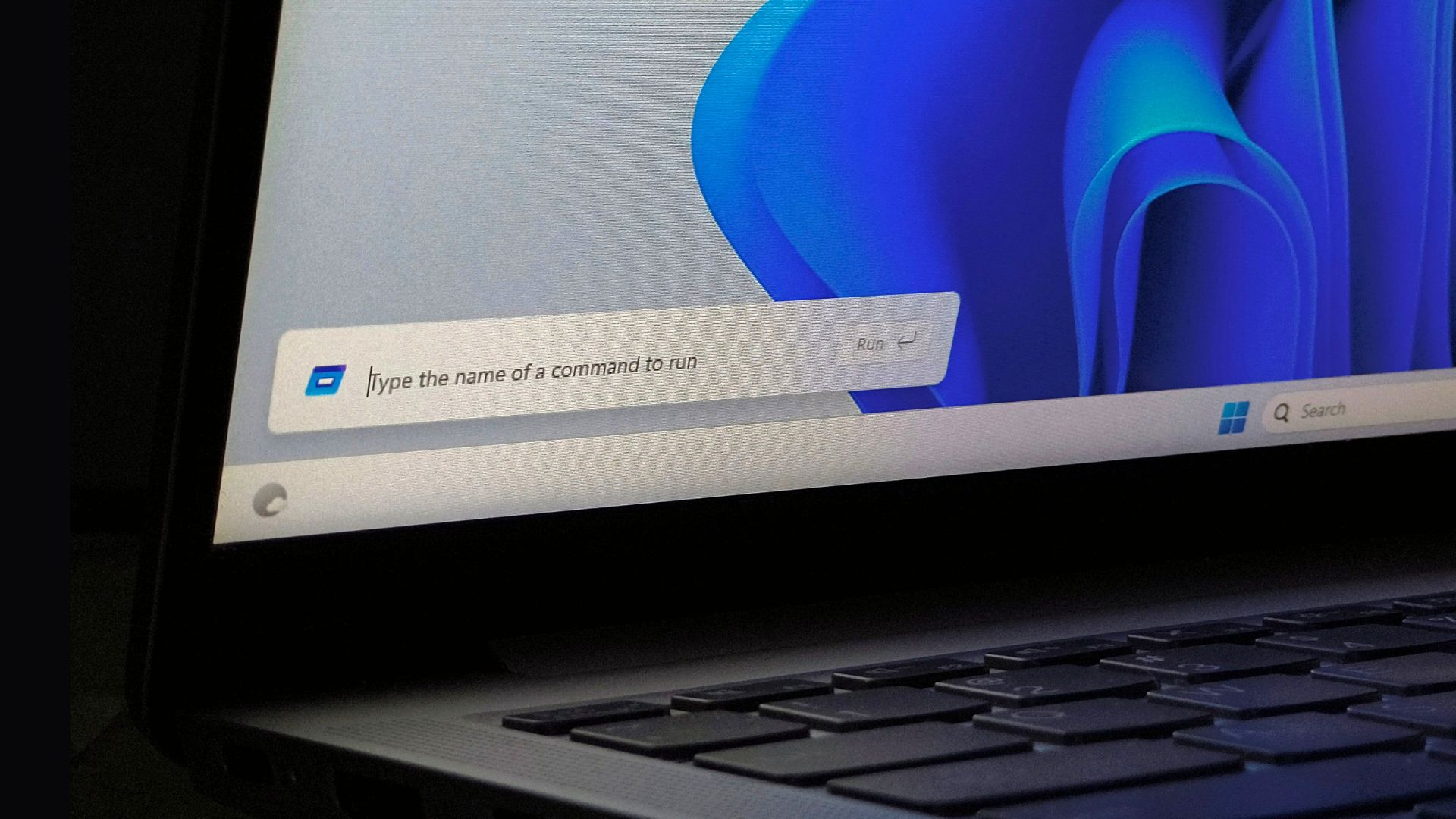
Microsoft confirms Windows 11’s File Explorer Properties dialog is a real WinUI rebuild, and more legacy dialogs are moving to WinUI next.
Microsoft says that their plan is to convert more Windows UI elements to WinUI3, while confirming that the new File Explorer Properties dialog was rebuilt from scratch in WinUI, and not just a fresh coat of paint.
Windows 11 has felt inconsistent for a while now. Modern panels are right next to decades-old dialogs, RAM usage keeps creeping up in apps that are supposed to be native, and popular Windows apps keep turning into web wrappers because developers don’t trust Microsoft to stick with a UI framework.
I honestly cannot believe how bad the new UI feels. It’s like they just flattened all elements and reduce information density by increasing whitespace, followed by a shrug and no additional thought into what was lost and what should be added. Which… now that I think about it, is Windows 8. hmm.
Yeah, its insane how shitty it is. Its malaevolance for the user.
It’s vibe coded guaranteed.
It’s been downhill since Metro design (which was just beautiful on mobile phones)
I don’t know if this is a hot take but-
In my mind, Aero is peak UI. It had contrast, depth, high information density in all the applications. Well… high-ish. That’s also when they started putting Ribbon in everything. I’m not a fan of Ribbon menus.
Windows 98 was clearly the peak
Win 2000 was the shit. Last one I liked.
No it’s worse than 8.
8 just looked bad, but it still functioned just like 7 in the background if I recall.
11 is just vibecoded trash
Just the worst UI choices. I really hate the toolbar right now. If you want to open more than one thing from it you have to wait a second after clicking the first because the first one opening changes the positions of everything else. Like it looks pretty but it’s not great when its sole job is to be a launcher.
Seems small but case in point for the kinds of decisions they’re making (or not really making).
Having disabilities, this might just be the final push for me.
(and I really have no issues with finally migrating my desktops but it’s insane that that might be the final reason. Well done)
I was talking about the Windows UI on Mastodon the other day, particularly in reference to how I have it set to dark mode on my PC at work, but when I hit Send/Receive in Outlook I get a bright white, XP-ass-looking box pop up. Someone replied, “the older the settings boxes look, the more useful they are”. And I can’t disagree.
Yep. It was the same in Windows 10 where all their newer setting panels were just useless and you could do so much more with the old control panel.
This was the final straw that made me switch to Linux in fact.
I’ve been half wondering if they are already vibe coding everything, given the number of bugs that I’ve noticed in outlook online over the last few months
Sure do, they are called Microslop for a reason.
No doubt about it.
And they are not the only ones.
I think we’re already at the point where Linux is more compatible with Windows software than Windows itself is.
Long past, if you consider compatibility with older software. ironically, linux is also more compatible with windows software than it is with linux software themselves :D
The other day I tried installing Star Wars Dark Forces 2 from disk, complete with a ‘windows 95/98 compatible’ blurb on it. Heroic launcher got the installer running without issue and within a few minutes it was playing.
I ended up using the Openjkdf2 engine instead for some nice quality of life improvements, but it was still quite something to see Linux run a piece of software from 1997 so effortlessly.
My first experience with WINE was trying to install an old Windows 3.1/95 pinball game (https://www.myabandonware.com/game/3-d-ultra-pinball-creep-night-3fh) and just double-clicking the installer to see what would happen.
It installed and launched without issue and even added a shortcut to the KDE app launcher.
I use Bottles now to keep cleanly separated environments, but … even I wasn’t expecting things to just work like that? I thought WINE would be more difficult to figure out but nope!
We’re what, 14 years past when they should have done that? Windows 8 introduced the new UI style, and then Windows 10 was their chance to cement it. You can’t even blame compatibility, Microsoft’s own controls were all behind the legacy UIs. You can tell they were pushed and rushed out the door when nothing was ready.
At this point their UI has been so hacked and slashed that the fact that it compiles is a shock to me.
It feels stupid to say, but of all the things that got me to move to Linux and never even install Windows 11, it was that stupid Start menu. Windows 10 was kind of perfect. You had your full list of alphabetical apps if you needed it, but you also had the ability to pin nicely sized tiles for frequently used apps, sort them into groups, and even make folders. Windows 11 gives you a little grid of icons. Just a huge step back.
I don’t have the energy to rice my desktop anymore and KDE has been perfect.
The thing is, though, is that Microsoft is literally incapable of solving this problem when you think about it. So much of Microsoft’s current business model is centered around being able to subtly direct you and your actions and maintaining tight control over the UI experience is key to that. People aren’t stupid and they’ll always feel that friction, so it’s just a push-pull of how much they think they can get away with at any point and slowly nudging it until it pisses you off again.
In the last forced update they managed to even make it worse, with a useless sidebar “connect to your phone and see notifications here, because reasons” and then removed recent files/applications to show a worse copy of iOS automatic category group, where windows tries and successfully fails to group the apps in some random group. It’s an ugly mess
I have to use Start 11 to bring back the perfect Win10 menu. I even miss the live tiles because it easily showed me weather info at a glance.
Months of work to redo one super basic dialog box.
It blows my mind how slow large companies are.
This comment in a different thread from someone who used to work for them gives some great background as to why.
The old ui (win7) was much better. I hate whatever this “rough frosted translucent glassy” with big buttons slop is.
codename AppleWank
Windows 7 with the classic theme was perfect imo. Also copying with ctrl+c broke sometime after win 7. I don’t know what happened but it never failed before win 10 and now I feel gaslit into believing I didn’t copy something I actually did.
Great. How about stop spying on us first?
And stop vibe slopping core applications. Notepad should be rock solid.
A former Microsoft engineer recreated the old notepad and it is less than 3 kilobytes. Source
as it should be. PaperClip on my old C64 was feature-rich and it took barely any memory. An empty Word document takes up more room than a Toronto condo and is about as useless.
Great point… i’m no expert in software development or user experience or whatever but it just seems obvious to stop adding friction in all forms including your notepad example. And of course the ads for OneDrive and suggestions on the start menu, etc…
The tough part to me is that it seems Microsoft is thinking they’re the hero by doing common sense stuff solving (part of) a pain they’ve introduced in the first place.
Anyway, I’m windows free after moving my gaming pc to cachy and couldn’t be happier.
should be rock solid
Mine is. But I grabbed the old exe from WinXP, and transplanted it into Win11, then took full ownership of the exe, so SYSTEM can’t replace it during updates.
Edit. Formatting
I see the authors have a sense of humor

And still Control Center will survive somehow like an undead cockroach.
How difficult it is to create an UI framework and stick with it?
Impossible, it would seem.
Not if you want to keep making the same product from 20 years ago over and over again. Something has to be different or people won’t upgrade and continue to buy slop.
Can’t wait to laugh at all the problems this will cause
Laughs in gnu
I recently HAD to switch to Win11, and it looks like a child’s toy. I cannot express how much I hate its look. It feels like a 30-year step backwards.
Sooner or later, I will be able to 100% leave the Microsoft (Microslop/Enshitifiaction environment.) On that day, I will be a lovable and righteous mother fucker.
I may not know you, but I feel compelled to tell you that I’m convinced you already are a, “lovable and righteous mother fucker.” (Despite the fact that I personally feel “mother fucker” should be a closed compound word, written as “motherfucker”. But I’ve been wrong many times.)
And there may be other OS options out there for you at some point, whenever it’s convenient for you to venture forth. Key, however, is that you are certainly lovable and righteous.
I hope they actually follow through and start making the OS less a gallery of 2 decades worth of half-assed redesigns and more a cohesive, responsive design. Dare I say their last actually decent UI update may have been Windows 8 which was also half-assed but at least it worked well from what I hear. Windows being a centrally controlled OS should be better at this than Linux and yet they aren’t!
I would like one settings menu to rule them all. Even if the settings menus links you out to a dialog box that’s better than “Look up control panel for the other half of the settings” and " we moved some of the network settings but not all". Who are that testing these systems on?
Windows being a centrally controlled OS should be better at this than Linux and yet they aren’t!
that’s what I was thinking too, but to be fair historically linux wasn’t a GUI centered world, so there were not much core system GUIs that could become obsolete