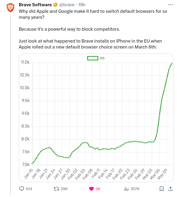
FatCat@lemmy.world to Technology@lemmy.worldEnglish · 2 years agoThe DMA already having an impact. Brave Browser installs surge after introduction of browser choice splash screen on iOS.lemmy.worldimagemessage-square112linkfedilinkarrow-up1143arrow-down113file-text
arrow-up1130arrow-down1imageThe DMA already having an impact. Brave Browser installs surge after introduction of browser choice splash screen on iOS.lemmy.worldFatCat@lemmy.world to Technology@lemmy.worldEnglish · 2 years agomessage-square112linkfedilinkfile-text
minus-squareWolfLink@lemmy.mllinkfedilinkEnglisharrow-up18arrow-down4·2 years agoMisleading graph trying to make a 150% increase look like a 1000% increase.
minus-squareEager Eagle@lemmy.worldlinkfedilinkEnglisharrow-up13arrow-down1·2 years agothat’s a ~40% increase looking like a 300% increase
minus-squareSchmidtGenetics@lemmy.worldlinkfedilinkEnglisharrow-up9arrow-down4·2 years agoRead the left side? 7k-11k, the removed useless information, provided you read what is actually there first.
minus-squarestrawberry@kbin.runlinkfedilinkarrow-up2arrow-down4·2 years agono one reads that. didn’t even bother to look. should be more transparent IMO but whatever
minus-squareSchmidtGenetics@lemmy.worldlinkfedilinkEnglisharrow-up1·2 years agoIf you don’t how are you supposed to know what information it’s telling you? It could shades of purple for all you know.
minus-squaredoublejay1999@lemmy.worldlinkfedilinkEnglisharrow-up2·2 years agoWelcome to the transparency of Brave !


Misleading graph trying to make a 150% increase look like a 1000% increase.
that’s a ~40% increase looking like a 300% increase
Read the left side? 7k-11k, the removed useless information, provided you read what is actually there first.
no one reads that. didn’t even bother to look. should be more transparent IMO but whatever
If you don’t how are you supposed to know what information it’s telling you? It could shades of purple for all you know.
Welcome to the transparency of Brave !