The letters are more pleasant, but my god, that kerning is absolutely awful. It’s horribly inconsistent, and some combinations of letters are spaced apart by half the size of an entire space, while others have barely any spacing.
For as bad as calibri is, at least it was easy to tell words apart.

So let me get this straight. It replaces Calibri, but nowhere on the page is a visual comparison of the two.
It seems like something you’d put right at the top.
https://office-watch.com/2023/aptos-calibri-comparison/
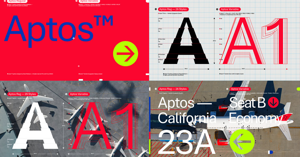
Slidey thing to compare <3
The letters are more pleasant, but my god, that kerning is absolutely awful. It’s horribly inconsistent, and some combinations of letters are spaced apart by half the size of an entire space, while others have barely any spacing.
For as bad as calibri is, at least it was easy to tell words apart.
See? That’s what the original page should’ve had!
Almost feels like it’s more about kerning than actual character changes. Though I do prefer the symbols of calibri.
The kerning is absolutely awful.
Just look at the “cr” in “hovercraft”.
Or the “zy” in “lazy”.
Or the “rtz” in “quartz”.
Or “sph” in “sphinx”.
I get that kerning is hard, but the inconsistencies in Aptos actually make it harder to read, despite the glyphs being wider and more distinct.